TYPE
Interactive Art
Installation
TIMELINE
Dec 2023
TEAM
Seeun
Soojung
Naejung
Role
Conceptual Design
Web Design
3D Construction
LIVE WEBSITE
BUILT WITH
Next.js, Typescript, Tailwindcss
Overview

Viewpoint of Typeface
"Viewpoint of Typeface" explores how typography is perceived and interpreted differently based on perspective and position. Set in a large 3m x 5m x 3m space, the exhibit features oversized alphabet structures that transform visually depending on the viewer’s angle—appearing as stripes from one side and clear letterforms from another.


This exhibit challenges the assumption that typography is a neutral vessel for communication. By exaggerating the form, texture, and weight of language, it highlights how the arrangement of text in modern society can distort meaning and influence perception. Visitors physically navigate the space, experiencing firsthand how the same typeface can be seen, felt, and interpreted in entirely different ways. Through this immersive interaction, the exhibition suggests that typography does not merely convey messages but can also reshape and even constrain how we process language.


Nuance of Typeface
"Nuance of Typeface" explores how typefaces function not just as tools for conveying information, but as expressive mediums that shape perception and emotion. By deconstructing and reconstructing the structural characteristics of fonts, the exhibit highlights the subtle yet powerful nuances that influence how we interpret written language in the digital age.


This installation features Times New Roman, Didot, and Avant Garde Gothic, three distinct typefaces with purposeful design traits. Stripping away their literal meaning, the typefaces are broken down into their pure formal elements, reassembled into patterns, and transformed into 15x15cm tiles that cover the exhibition walls. This immersive approach invites visitors to experience typography beyond its functional role, focusing instead on how form, structure, and aesthetic variations affect the way we process information.

Times New Roman
Avant Garge
Didot


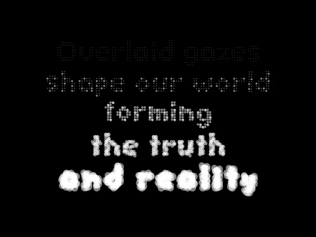
Bias of Typeface
This work is an interactive web project that offers a profound reflection on the consumption of information in modern society. For this exhibition, I developed a dedicated typeface family comprised of circular base units, designed to change in volume based on the amount of attention it receives This exhibit utilizes random online article titles, tracking where viewers' gazes linger using mouse-hovering data.
This intriguing approach results in letters where the gaze is concentrated growing larger, while those overlooked shrink progressively. When the letters enlarge beyond a certain level, they become distorted to the point of being unrecognizable, symbolically representing how information can become skewed as the public focuses biasedly on a single piece of information.

Multiple clients are connected via web sockets, enabling event exchange when the mouse hovers over words.
When the characters that fade to a level below 1 (reaching level 0) constitute 50% of the entire sentence, the source is replaced with a different article.


REFLECTIONS
Takeaways
This project challenged my perception of typography as a neutral tool for communication and deepened my understanding of its role in shaping meaning, perception, and bias. By deconstructing typefaces and reconstructing them into immersive experiences, I explored how typography is not just a vessel for language but an active force that influences interpretation.
What I Learned…
Building conceptual inquiry with physical execution:
From research and ideation to exhibition design, I was involved in every stage of the project. Translating abstract questions about language and perception into physical and interactive experiences strengthened my ability to bridge conceptual exploration with tangible execution, ensuring that visitors could actively engage with the themes